OTTAWA FAIRY AND FAMILY PHOTOGRAPHER/ BLOGGER/ TEACHER/FAIRY PORTRAIT PHOTOGRAPHY/OTTAWA GRADUATION PHOTOS/PROFESSIONAL STUDIO PHOTOGRAPHER/OTTAWA GRAD HEAD SHOT PHOTOGRAPHER
OCTOBER 2023

*
PRIMARY SHAPES INCORPORATED IN VISUAL DESIGN
Hello Ladies & Gentlemen:
I would like to reflect on various items in this months blog pertaining primarily to Autumn photography which is a season many photo enthusiasts long for!
Firstly, is it not quite remarkable at the diversification and splendour of Autumns harvest of colours? This is a time to unquestionably awaken your senses to foliage that you would commonly walk by without noticing at different times of the year. A great comparison on your behalf would be to view a particular scene you are familiar with in October to the same environment represented in early summer and late November for example, when trees are either flourishing or stripped of their leaves appearing as lifeless objects incapable of supporting life. On a note of inspiration…. November for many people of all walks of life seems to dictate a loss visually and mentally with winters soon arrival, and it need not be that way! I recall articles in photographic magazines over many years by full time landscape photographers, indicating they prefer late Autumn into November because it provides them with distinctive lines and design of imagery that were invisible in summer months due to leaves covering tree branches.
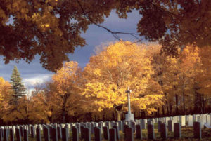
*The circular yellow tree above is a frequent strong point of visual design.
Recently on an early mornings drive, I came across an area that featured a remarkable sense of attractive contrasts of shadow to highlights, including beautiful repetition of both vertical and horizontal lines. Fifty percent of the tree trunks/columns lit by early morning direct hard side lighting, created bright strips of colour permitting me to direct my camera in several angles of view, capitalizing on their visual strength. In another area, horizontal bands of continual colour hosted separate rows of red and orange leaves creating a visual attainment comparable to an actor debuting a new performance on stage.
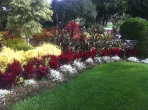
*Notice the triangular shape of the green lawn in comparison to the image below. Triangles in all types of imagery increase and strengthen design.
When designing your imagery, one should always be mindful of the primary shapes of visual design being the circle, square/rectangle and triangle. Each time you consider making an exposure, you are already well on your way to utilizing the rectangle in image design based upon the shape of your viewfinder. These fundamental, dominant shapes should be incorporated into your imagery if available, to give viewers a visual resting place they can relate to from their past. From youth we are shown imagery containing these repetitious shapes. Designing imagery on your cameras ground glass can be a rewarding experience! For most individuals, digital or 35mm film cameras feature a “rectangular” view screen. I have 120 format film cameras as well which feature “square groundless” view finders. Designing your imagery within either medium and incorporating the “rule of thirds” in composition design regardless of camera format produces dynamic imagery carrying a well thought out message from the photographer. Photographers who regularly adhere to this element of design structure, guide the viewer to specific areas in the image that he/she feels anchors the picture in a visual resting place. This directorial approach should provide viewers with an alternate area of visual exploration created by a “secondary motif” or subsequent visual resting place, complimenting the main subject but not detracting from it. Depth of field characteristics in lens settings play a large part of this picture design element.
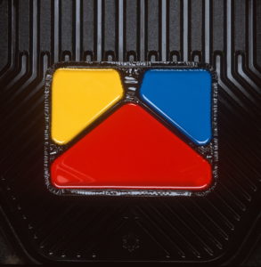
*Strong triangular design is often found in overlooked areas whether it be nature or product photography.
When making decisions regarding exposure for the “novice”, a good suggestion would be to alternate your exposures slightly which varies the contrast level of your imagery.
***I am not one to suggest you create numerous images of the same scene, but in the learning process, it is beneficial to examine how levels of contrast can be altered to either provide additional information in shadowed areas showing more detail, or subtracting it creating harsher, more contrasting images. (The term “bracketing exposures” applies to the previous statement when one elects to produce numerous images of the same scene. This I believe for many creates a crutch and a barrier to learning, and this habit overall should be avoided). Higher contrast imagery frequently contains little information in shadowed areas, making printing the images very difficult unless this is the effect you desire.
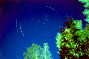
*Circular repetitious star trail patterns accompanied with a strong triangular base of green trees provides support for imagery.
*Thought provoking initial actions in visual design will reward you compositionally, particularly when pursuing a “slower approach” when composing your images. Invest the necessary quality time when looking through your viewfinder which will prevent alterations of imagery afterwards in photo manipulation programs. A good practice to make a habit out of is to use your camera frequently with a variety of lenses, if available, providing you with a greater sense of predictability. Lenses have their own “personalities” so to speak regarding contrast values and depth of field abilities.
***Getting to know the characteristics of your lenses is like sitting down with an old friend who shares predictable levels of personality/judgment/performance.
In conclusion, the addition of a tripod in proper visual design should be considered mandatory! If you have elected to make a substantial investment in a high quality camera system, you are forfeiting it’s ability to provide you with exceptional results utilizing only hand held gestures. Don’t deny yourself shortcomings in visual design regarding the absence of a tripod. You are absolutely worth more than that!
With Good Wishes Extended,
Jeff Ryan Photography/Ryan Studio
www.jeffryan-photography.com
